
Spot the difference!!
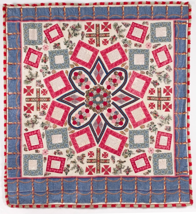
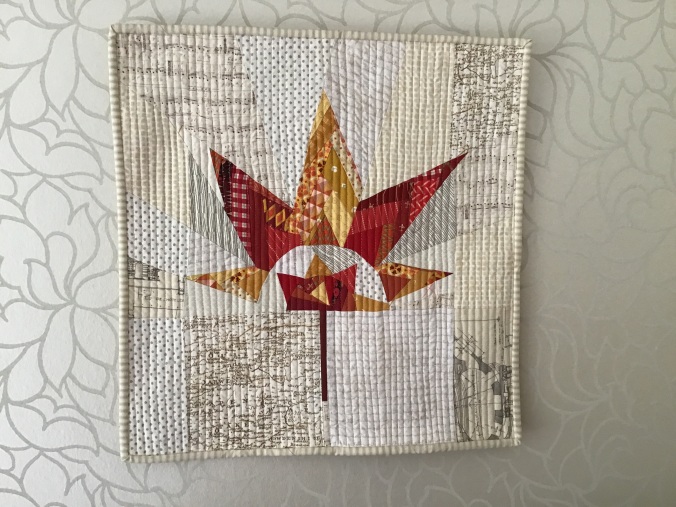
The Quilters’ Guild here in the UK is celebrating its 40th anniversary this year. In some ways it surprises me that it’s only been around 40 years bearing in mind quilting as a tradition and craft goes back many centuries. However for its’ ruby anniversary there’s been a challenge put out to members of all the specialist sections of the Quilters’ Guild to come up with a mini quilt based on one of the quilts in their collection. The quilt in question is the one above, the Bloomfield Coverlet (so in fact it’s not actually a quilt). And to cut to the chase my interpretation is just above. I think we can say I’ve interpreted it quite radically…. (incidentally this is a wordy post so I have sprinkled in some outtakes of my photos of my mini with my assistants.)
The Guild’s specialist groups include miniature , traditional, contemporary and its most recent arrival modern quilting.

I don’t think anyone could claim that the Quilters’ Guild were rapid in embracing modern quilting given the specialist group was set up in 2014 whereas modern quilting, according to a recent article in the Quilters’ Quild magazine, can be traced back to the early 2000s. And if I’m reading between the lines correctly the founders of the modern specialist group, Helen Howes and Heather Hasthorpe, had their work cut out to persuade the Quilters’ Guild to set up this new specialist group. But they succeeded.

Needless to say this acceptance of modern quilting as part of the Quilters’ Guild has been a runaway success. The Modern Quilt specialist section has numerous members all thanks to Heather and Helen who still play a huge part.
Another member who was in from the start was Kate Percival, who sadly lost her battle with cancer last year. It was Kate who put forward the idea that to commemorate the 40th anniversary it would be a good idea if there was a Guild wide challenge. This was taken up and the result will be a special exhibition of some of these mini quilts from the specialists groups, all with their own aesthetic, hopefully playing nicely together. It should make an interesting display.
As it happens the Modern Group has always had an annual quilt challenge to make a 20” mini quilt based on a theme. I’ve always taken part and an example is this one based on the theme triangles which I can see from where I’m writing. But obviously this year we will follow the Guild challenge.
I don’t know what your reaction to the Bloomfield quilt is but I don’t think there was universal excitement at the choice of quilt. It’s a bit of a funny one. Helen Howes wrote a very interesting piece about it to spur us on We were also given access to a high resolution image so you could really go up close and personal.
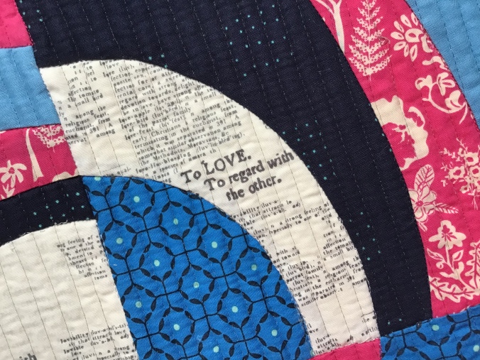
It certainly wasn’t a quilt that set my pulse is racing. I’m not really a blue and pink person and even after over 150 years these fabrics are very vibrant as you can see from the close ups below. Neither am I keen on sentimental poems and the layout is a strange concoction.
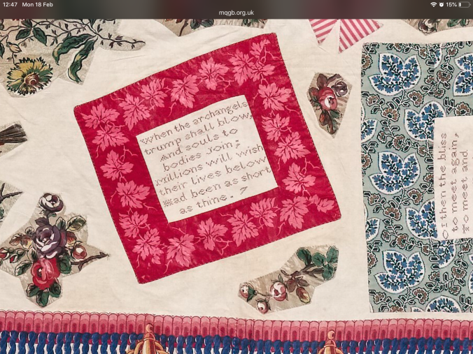
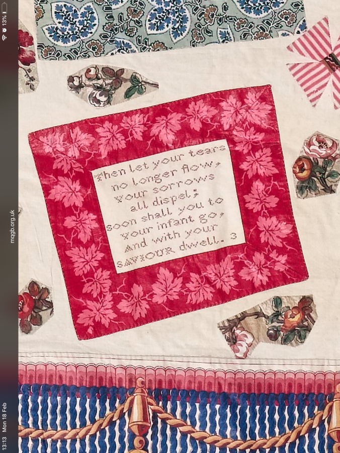
There is very little known about why it was made but because a number of the passages relate to the death of babies and young children it’s been assumed that it was made as a commemorative quilt in honour of such sad losses. But I wonder about that. If you look at the poems about the passing of babies such as the two below they don’t strike me as being sewn by a grieving mother. They come across as, quite frankly, rather callous! Along with many many women I have had a miscarriage and trust me even though I have a strong faith I would certainly not be putting my loss in these terms!


I wonder whether they were sampler embroidery pieces perhaps done on a Sunday where sewing had to be religious. I recall going on a family holiday to a Christian Guesthouse and every Sunday the table tennis room was locked! My brother and I were deeply unimpressed. But it would have been seen as a typical Victorian virtue and maybe in later years the maker came across these samplers and then arrived at this rather piecemeal layout. Scattered across the quilt, to fill in the gaps, are appliquéd fussy cut flowers and birds. Which even with the kindest eye look a little, shall we say, unsympathetically cut. Perhaps there wasn’t much of that material and the maker had to make it stretch.
Coming up with a modern interpretation was surprisingly difficult. In the end I decided to take from the quilt the things that I liked and then try and imagine a more modern interpretation.

I like the circular nature of the overall design, its symmetrical, I like the darker parts as it gives a bit more depth and I rather like the red and white binding although it’s actually a fringe. I felt I had to stick with the main colours of blue, red/pink and cream as the design was going to be so different but I used a floral pink fabric to echo the flowers in the appliqué pieces between the embroidered passages and a balancing blue. And by sheer luck I had a red and white striped fabric in my stash for the binding. The text print (which replaced that other neutral in the picture above) was in lieu of the embroidered words and of course what modern quilter doesn’t use text fabrics… I also chose a sentimental text print as you can see from the extract below.
As to the design I love curved quilts and enjoy a bit of freehand curved sewing, in fact in a rather pleasing way it was Heather’s eccentric crosses that taught me how to do this in the first place! I had seen a design on Pinterest that caught my fancy from a Fons and Porter magazine. I had no idea how to get hold of the pattern so just drew some curves….Because I wanted this to be symmetrical I drew up a template out of freezer paper, cut the curves by hand and used that for the four sections which then got sewn together.
I wondered about introducing more neutrals to give the quilt a paler background like the original quilt but in the end, taking my lead from the recent entries at Quiltcon, I chose big and bold.

It will have to have a title if it’s going to be submitted for the challenge so I have chosen The Circle of Life. It struck me that there is a sense of connection with the past quilter and previous lives let alone the rather morbid sayings in the original quotes representing birth and death. And of course it does contain a circle albeit a rather swirling one. I did toy with the rather facetious title of Spot the Difference. Depending on how wicked I am feeling at the time I may choose that one!
I think Kate would have liked this quilt. She didn’t shy away from colour and as Helen said we should be making these quilts in memory of her as much as this vintage quilt.

My first reaction was sheer surprize, those are not your colours! But reading on, all became clear. I love the bold circular theme, and get the relation to the old quilt. I wouldn’t have called that a traditional quilt either.
LikeLike
Thanks for the supportive mentions! I love this piece, you’ve done a great job.
I’m working on four small quilts all quite different. That’s because I belong to four specialist groups
, and I want to do it in memory of Kate.
Great post.
LikeLike
This is absolutely fantastic.. I feel I’m not getting this quite right yet..
LikeLike
Wonderful job!
LikeLike
Thank you so much for sharing the story and your interpretation. It is so enriching to be in a different country (USA) and hear about other quilting traditions and groups. I love your interpretation and the Circle of Life execution. Great job!!!
LikeLike
Really enjoyed learning more about your challenge quilt
LikeLike
I really like you interpretation and your explanation and discussion of the challenge was interesting. Hopefully these will all be displayed at FoQ this year, I shall be sure to pay them a visit.
LikeLike
What a wonderful quilt! So great to read the description of its inspiration, and the journey to get from the original to the modern interpretation. It will be interesting to see how everyone interprets the same quilt in (undoubtedly very) different ways.
LikeLike
What a wonderful quilt! So great to read the description of its inspiration, and the journey to get from the original to the modern interpretation. It will be interesting to see how everyone interprets the same quilt in (undoubtedly very) different ways.
LikeLike
As you say, an, um, odd choice of quilt for inspiration, but I love your interpretation of it and know which one I’d rather have in my house..! I’m looking forward to seeing the exhibition and seeing how others have interpreted the quilt. Thanks for furtling!
LikeLike
absolument magnifique!
LikeLike
Pingback: Festival of Quilts 2019 – at speed! | The Lilac Cat
Pingback: A rather late review of 2019…and what next | The Lilac Cat
Pingback: A rather late review of 2019 | The Lilac Cat