
A night shot to get in before the deadline

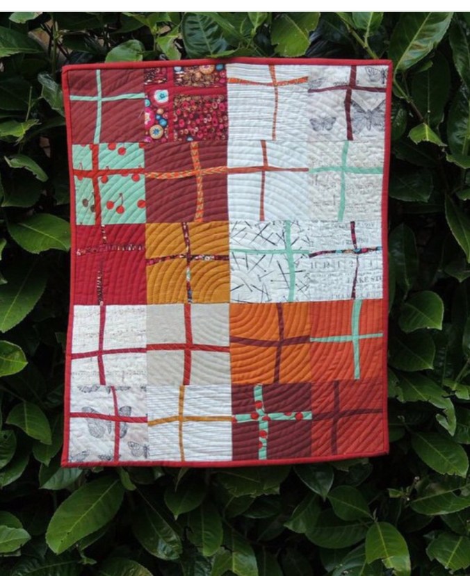
Quilt name: Coral Glitter
Size: 43” by 37”
Location: UK
Each year Pantone, the colour advisory organisation comes out with a colour of the year. I’m not entirely sure of the purpose of picking one colour but I guess the idea is to promote Pantone and to get people excited about a particular colour and how it can be used in fashion and styling. Anyway it’s the perfect excuse for a challenge to Quilters to make a quilt featuring that colour. Rebecca of Bryan Quilts and Sarah of No Hats in the House are hosting it this year.
This year it is Living Coral.
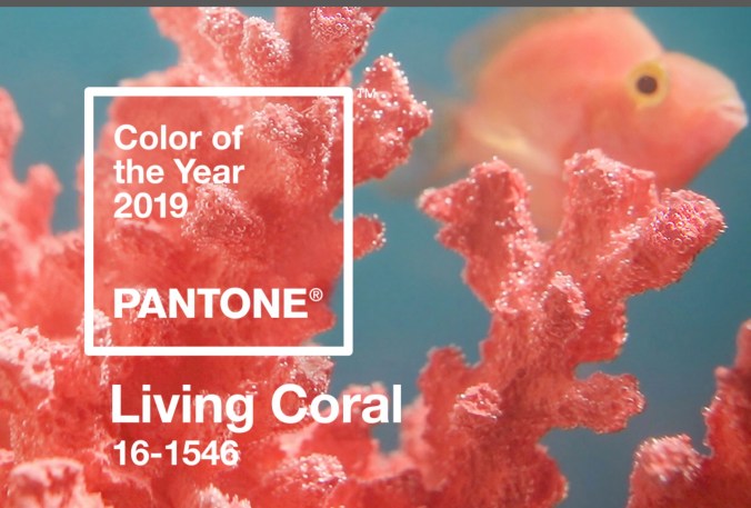
The last time I participated was 2015 when the colour was Marsala, a burgundy brown, no not the colour of a curry!
Since then the colours have been purple, bright green and a weird pink/ baby blue combo. None really inspired me but I like coral so I thought I would go well out of my colour comfort zone and blend it with some other colours to make an improv curvy design.
As to design I’d always liked pointy shapes like diamonds, Jen Kingwell’s Glitter block (in honour of which this quilt is named) and the periwinkle block. I was further inspired by an unattributed wood block design on Pinterest that appealed to me but I reworked it into curves and different colours using fabric of course and it became this quilt.
I first sketched it out in TouchDraw, the poor man’s EQ software! It was very helpful in pinning down the colours. Also by fluke I extended the background and got that large negative space to one side which made it for me as a design.
As you can see it’s pretty similar although rather rough and ready.

All the fabrics are Kona and the main colour is Curry, along with Nectarine, Green Tea, Bone, Mediterranean and Overcast. They have such nice names. Someone must have fun thinking them up. It’s interesting how the coral really brings the piece alive.
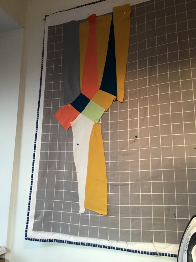
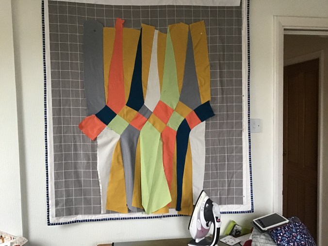
Assembly was frankly quite a headache. A range of methods were used from the inset circle method using freezer paper, improv curves for the very gentle curves and those that are more pronounced I fitted it up on the design wall. It was like a steps exercise class as I needed steps to reach my design wall and I was up and down, up and down….
It was also a little bit like dressmaking as I pinned the pieces in place. It was assembled in curved pieces…
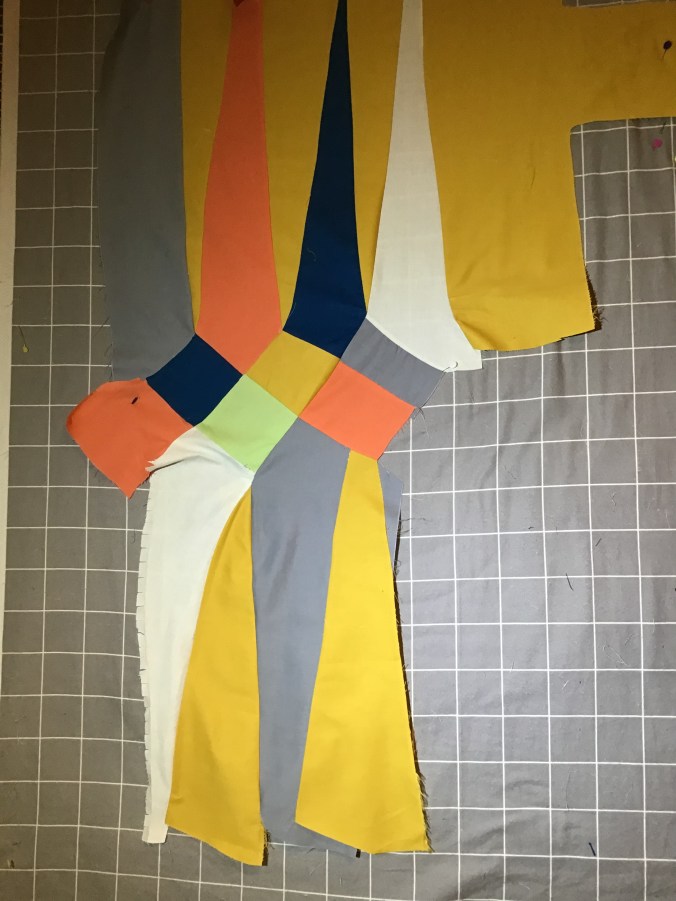


The final assembled quilt top was a bit baggy in places so needed a fair bit of readjustment to get it flat, well flatter! You can see the amount of flapping on the bottom section. For some reason the top section and the pieced middle were pretty good but it all went pear shaped, quite literally, in those bottom sections.
As to quilting I just wanted something very simple but with bags of texture and went for match stick quilting, well not actually matchstick width, a bit fatter than that but I was nervous that too much quilting might dilute the design.. I used a range of different coloured threads to match the fabrics in the quilt.

One departure from usual was not to use double wadding which I would always do for a wall hanging but have one layer as usual but use a layer of headliner fabric. This is the material which is a very thin foam on one side and fabric on the other which is used to upholster the inside of ceiling of cars. It looks as boring as this, even Felix is unimpressed. …..
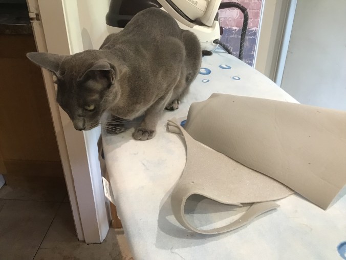
But headliner is fantastic stuff, it’s cheap, it gives great structure to bags and 3d objects and I just wondered whether it would work for this wall hanging. Sewing through to quilt it was relatively easy but it does need pin basting. For some reason the usual adhesive basting glue I use just doesn’t cut the mustard. And it does make the quilt more unwieldy when you are wrangling it through a domestic sewing machine at the quilting stage. But overall it gives a nice firmness to the quilt, perfect for a wall hanging but not perfect for one that you want to snuggle up in.
its been a bit of a mad dash to get this finished. I thought I’d done that earlier today and even was so well organised I had taken outdoor pictures.
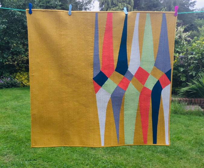
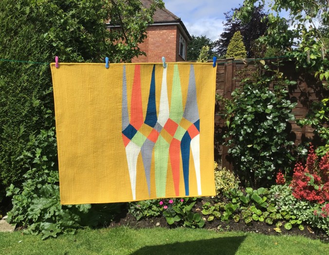
Can you see the difference? When I looked at the original quilt in the top photo it didn’t look enough like the original design on TouchDraw, crucially no right hand border and it looked out of balance. So nearly 4 hours later it looked much better but no outdoor picture as it was midnight here. The deadline is 5am UK time so plenty of time…..!!
UPDATE Snooked one in when the sun came out the next day. Nothing beats natural light!!

TIME YOU WERE ASLEEP!!
Dad
>
LikeLike
Wow Jenny, I love this! You’re right adding the right hand panel balances the pieces. Thanks also for sharing your design process, it great to see it coming together. Also glad you got it finished on time. Good luck.😊
LikeLike
Brilliant…love it
LikeLike
Pingback: La couleur de l’année 2020 élue par PANTONE – La Ruche des Quilteuses
Pingback: A rather late review of 2019…and what next | The Lilac Cat
Pingback: A rather late review of 2019 | The Lilac Cat